Contrast of Buttons and Graphics
The following criteria are taken from the checklist:
- The contrast between non-text adjacent areas (for example between an icon and its background) is sufficient: at least 3:1.
Many people with visual impairments and color vision deficiencies need good contrast to be able to perceive graphic controls and graphics that convey information.
Accordingly, adjacent colors, for example the color of an element to its background color, must have a contrast of at least 3:1. For graphics with many different colored areas, this criterion only applies to the areas that need to be perceived for the content to be understandable.
The color contrast of buttons and graphics can be tested with the Colour
Contrast Analyser (CCA)
. Further information on this can be found in the manual entry for
Color Contrast Tools
Realization of the criteria
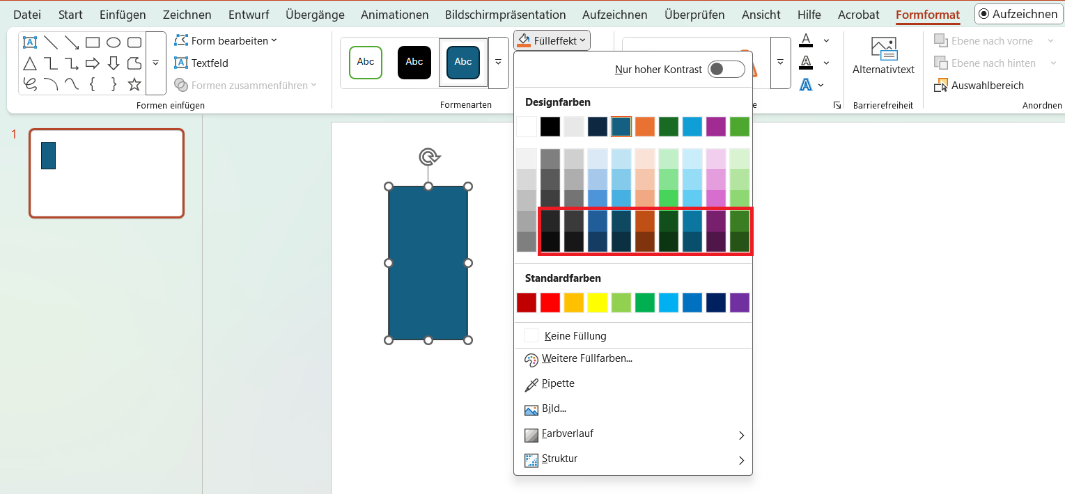
Use colors with high contrasts. With a white background, this corresponds to the bottom two lines of the colors offered by PowerPoint.
Menu bar: Shape Format > Shape Styles > Shape Fill
The following criteria are taken from the checklist:
- The contrast between non-text adjacent areas (for example between an icon and its background) is sufficient: at least 3:1.
Many people with visual impairments and color vision deficiencies need good contrast to be able to perceive graphic controls and graphics that convey information.
Accordingly, adjacent colors, for example the color of an element to its background color, must have a contrast of at least 3:1. For graphics with many different colored areas, this criterion only applies to the areas that need to be perceived for the content to be understandable.
The color contrast of buttons and graphics can be tested with the Colour
Contrast Analyser (CCA)
. Further information on this can be found in the manual entry for
Color Contrast Tools
Markup of Colored Buttons and Graphics
CSS code is required to implement the following criteria.
Background color:
Add the style attribute to the tag and specify a color value in the background-color property. This can be hexadecimal in the form #ffffff or an RGB value in the form rgb(255,255,255).
<p style="background-color: #1f4180;">Der Hintergrund dieses Elements ist farbig.</p>